Chapter 5 Results
5.1 Correlation between Vaccination, level of education, and the type of employment which is dominant in a state

The above plot displays the number of vaccines distributed each month. It seems that the maximum number of vaccines were distributed in October 2021, followed by September 2021. Additionally, it is important to note that states with huge population like California and Texas received the maximum number of vaccines. Thus, we can conclude that the vaccines were distributed as per the population of each state. States with higher population received more vaccines than states with less population.
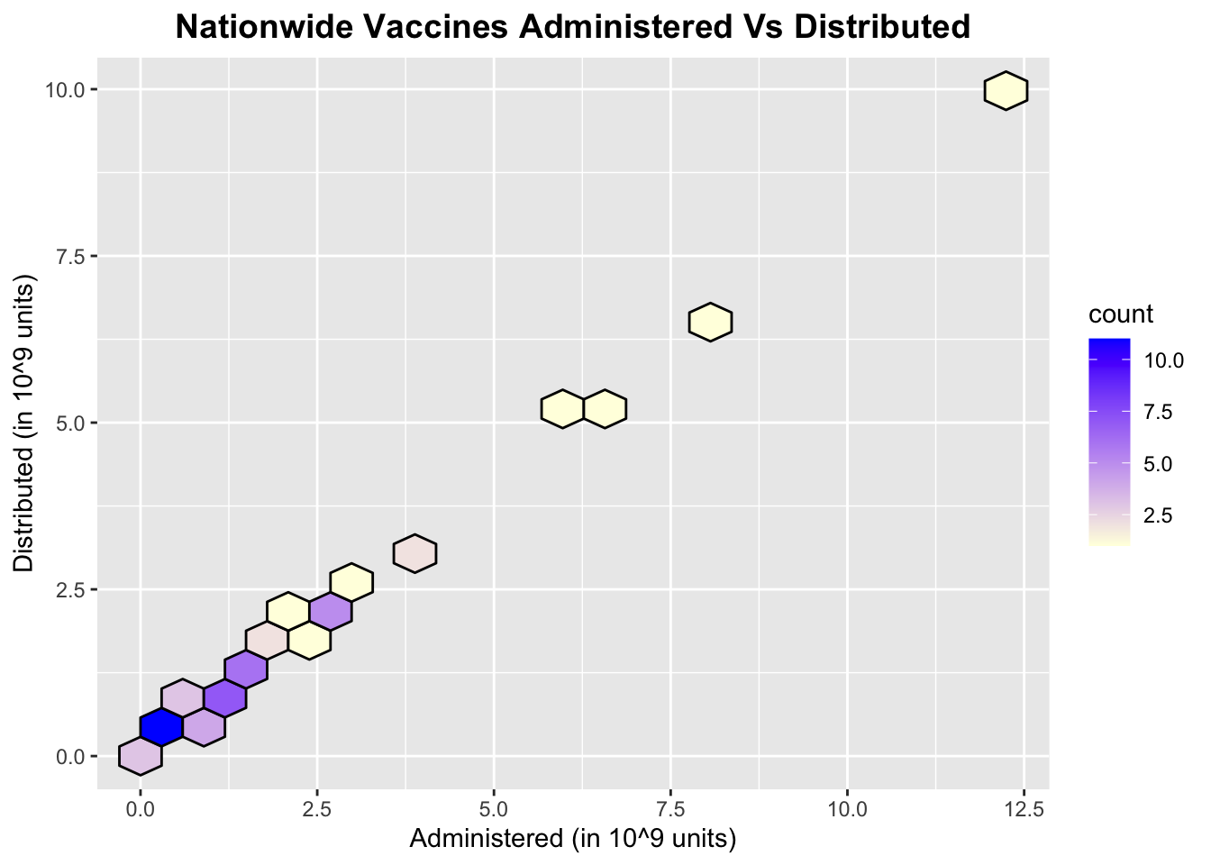
If we look at a larger picture considering the nationwide vaccine administration and distribution, we can see that the number of vaccines administered is directly proportional to the number of vaccines distributed. Additionally, maximum count where the number of vaccines distributed are approximately equal to the number of vaccines administered (which is one of the indicators for less vaccine wastage) is only valid in lower ranges of vaccines distributed/administered. With respect to the higher ranges of vaccines distributed/administered, we can see a considerable deviation wherein the number of vaccines distributed differs significantly from the number of vaccines administered.
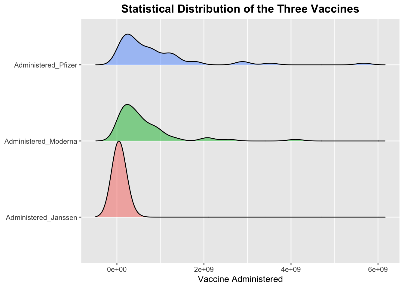
Through the above plot we wanted to understand the inherent distribution pattern of the administered vaccines. As it is evident from the plot, Janssen had almost a perfect normally distributed pattern but has lesser number of total vaccines administered than Moderna and Pfizer. Moderna and Pfizer have a larger span on the number of vaccine administered. Therefore, this gives us a fair idea that more people tended to prefer Pfizer and Moderna over Janssen. Additionally, an initial peak with respect to Janssen signifies that when Moderna and Pfizer were not present in decent amounts, people took whatever other alternative was present in the market (i.e. Janssen).
Note: The scales for the axis in the plot above were not getting modified to the desired format after multiple attempts.
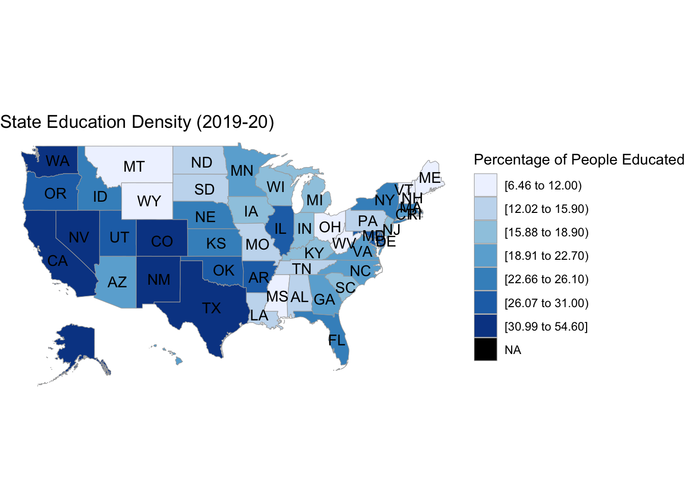
The above plot indicates the percentage of people educated in each state. We can see that the states of Texas, California, Colorado have the maximum literacy rate (between 30 to 55 percent) while some states such as Wyoming and Montana have the least literacy rate (between 6.5 to 12 percent).
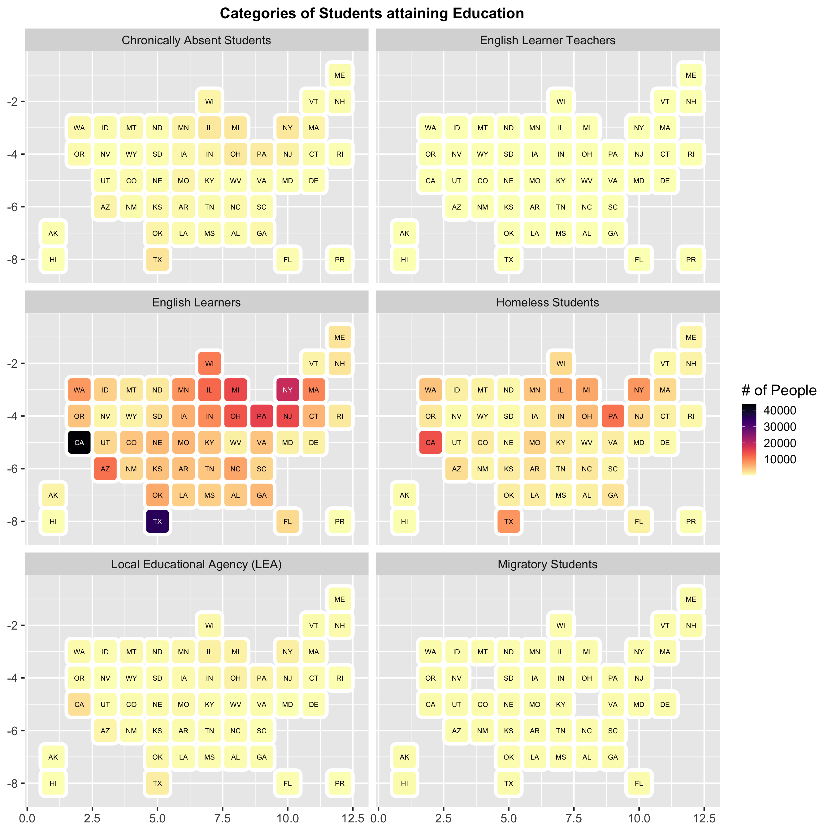
The above graph shows the number of different kind of students who were receiving education. There were very few students who remained absent from schools and colleges. This shows that the students are serious about the education and attend the classes regularly. English Learner Teachers and Migratory students were very low in number and are evenly spread across the country. We can also note that fairly very few students attained their education from Local Educational Agency.
Another important thing to look at is the number of English learners. These type of students are predominantly more localized in big states such as California and Texas. Additionally, an interesting feature to note is that the number of homeless students attaining education are also larger for these states. It is also a good sign that there are more number of homeless students who are working towards receiving their education.
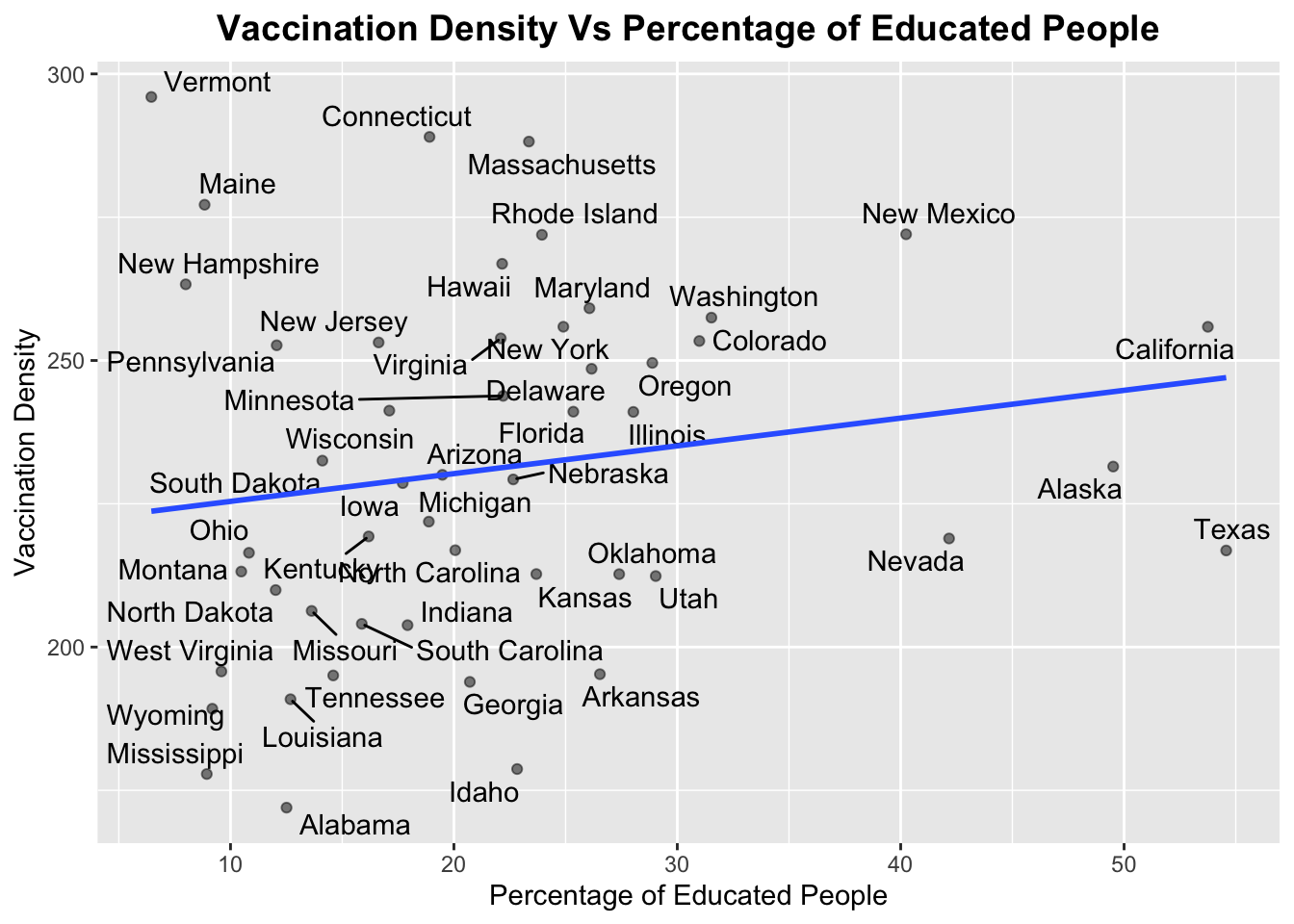
Therefore, from the plot above, we can analyze that as the percentage of educated people increases, the vaccination density also increases. Although the slope of the graph is not large indicating that there is not much dependence, but it still depicts that there will be some improvement in the vaccination rate if more people are educated.
Some interesting trend to note is that California and Texas both have a significant percentage of educated people but still California had a better Vaccination Density than Texas. While there are some other states as well such as Vermont and Maine where the percentage of educated people are very less but still they have very high vaccine administration density.
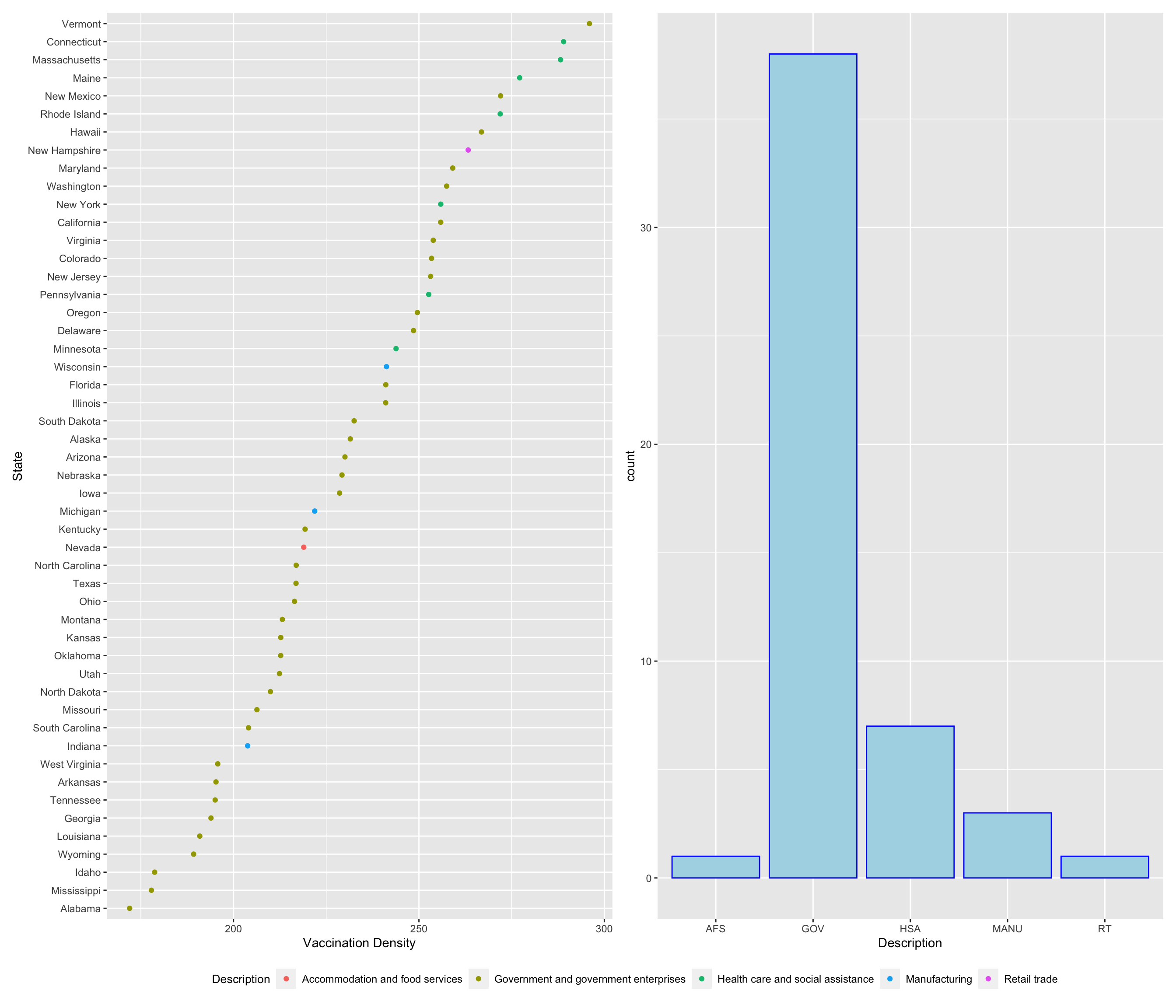
Description : “Accommodation and food services” : “AFS”, “Government and government enterprises” : “GOV”, “Health care and social assistance” : “HSA”, “Manufacturing” : “MANU”, “Retail trade” : “RT”
The above plot on the left displays the Vaccination Density (vaccines administered/population) in each state and the type of employment that is prominent in that particular state historically. We can observe that the majority of the people who have been administered a vaccine work in Government Enterprises or in Health Care Services. This might be happening because of the certain government policies wherein in front-line healthcare workers were being vaccinated first and thus the majority of the population vaccinated is composed of them.
Additionally, state of New Hampshire, where the dominant profession is Retail Trade also shows a good percentage of people having vaccinated. Some states like Alabama and Mississippi have the lowest vaccination density even when the primary profession of people in those states is a government job. This indicates that government of these states should focus more on the vaccination drive. Nevada being a heavy employer in accommodation services is doing good but can definitely work on it’s vaccination program to get more people vaccinated.
The graph on the right indicate the number of states that have a particular kind of maximum employment area historically. This shows that maximum states in the US have been historically employing people in government enterprises. Thus, these states should have been better in terms of vaccination. But as we can see from the graph on the left, people from these area of employment have not been quite enthusiastic about the vaccination drive in some states.
5.2 Correlation between vaccinations being administered and the number of crimes in each state
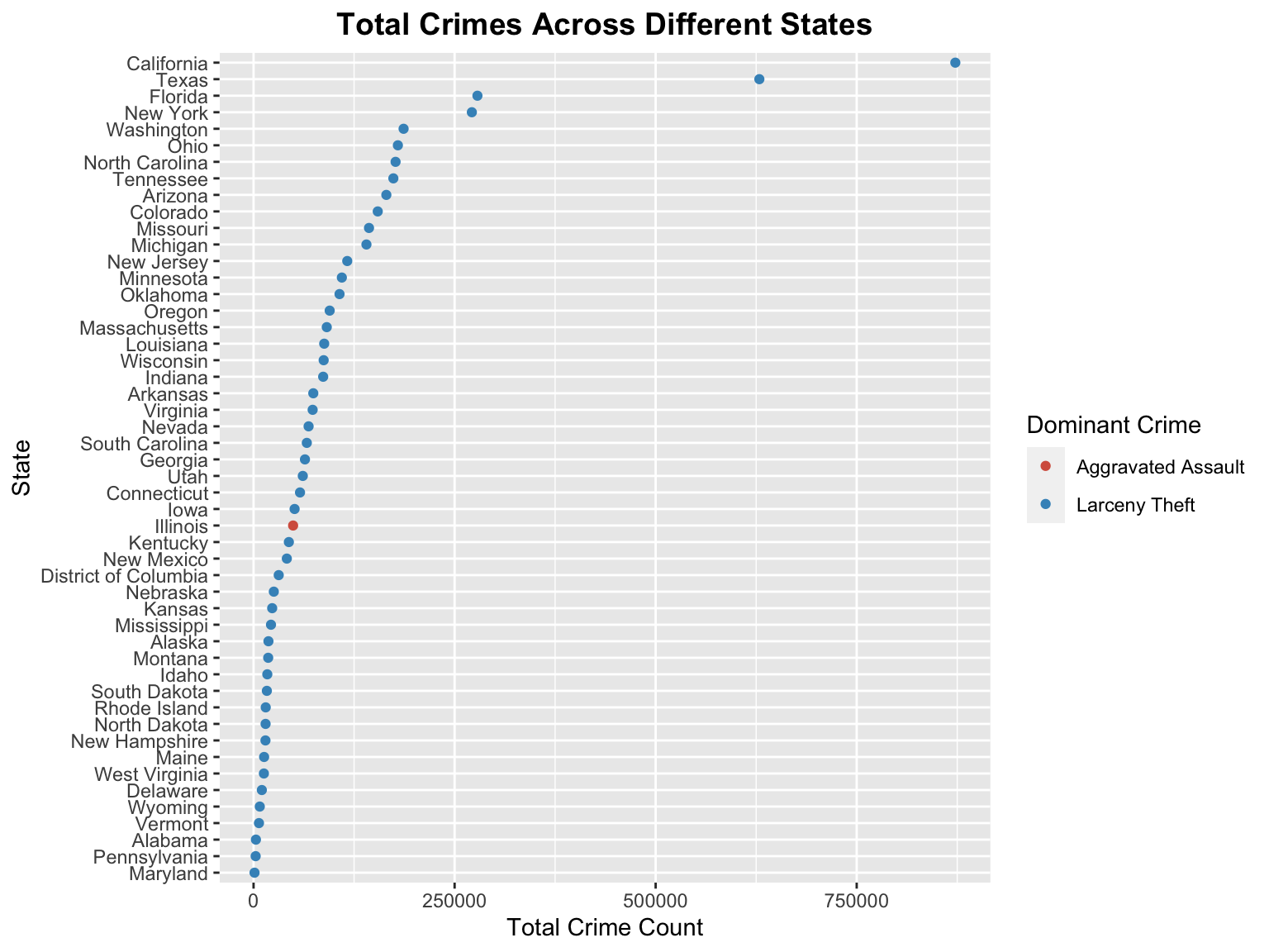
From the above graph, we can observe that majority of the US states had total number of crimes reported to be lower than 125000. A few states like Florida, New York, Texas and California had reported crimes higher than 250000 crimes with California reporting the highest number of crimes ( roughly 850000 ). Maryland, Pennsylvania, Alabama, Vermont and Wyoming have lower incidence of total reported crimes. Except Illinois, all the states have Larceny Theft as the dominant crime in them. Illinois had Aggravated Assault as the Dominant Crime.
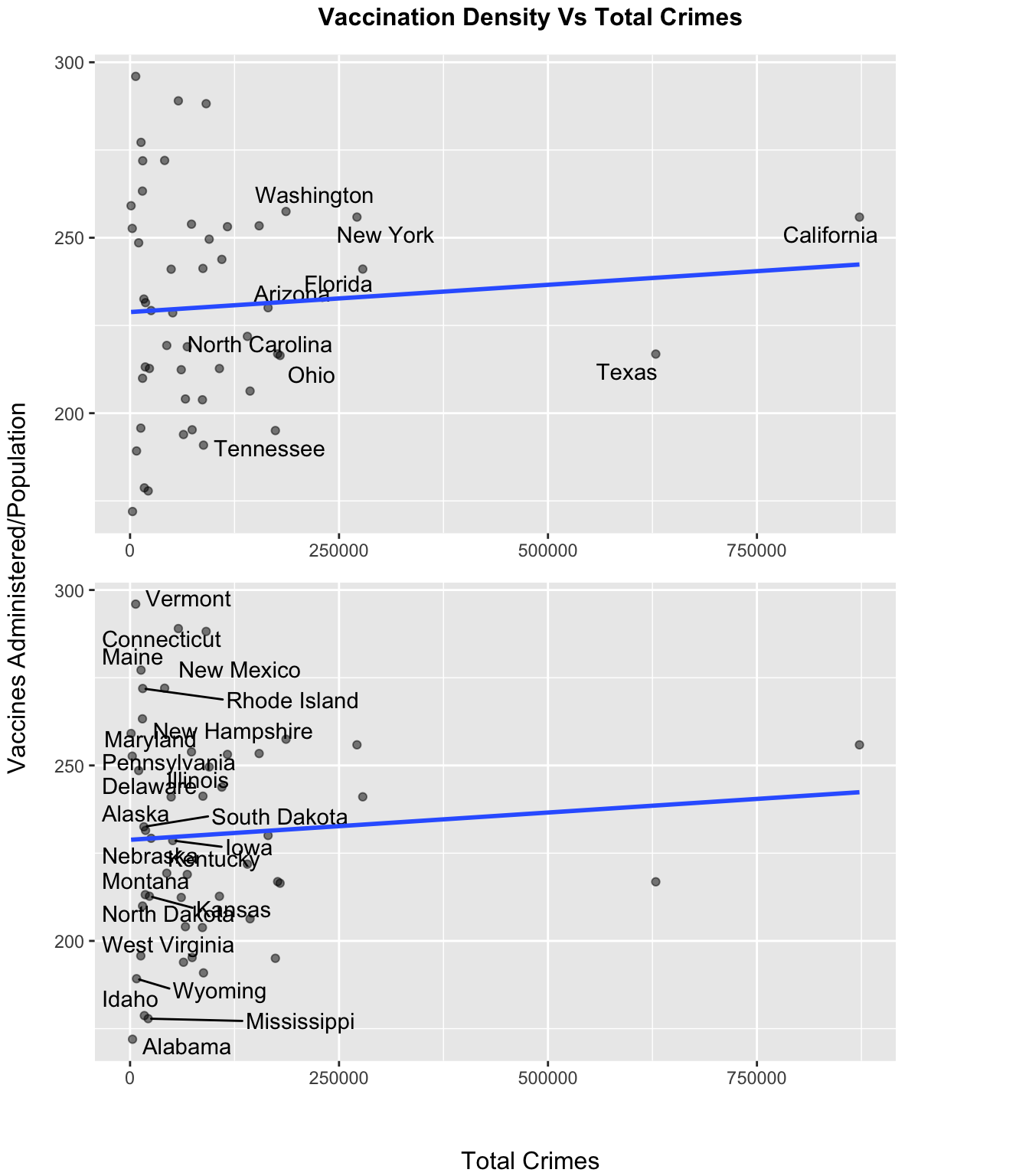
We try to observe a correlation between the vaccinations administered per unit population and the crimes reported in each state. From the plot above, we observe that states having lower reported crimes (less than 80000) have relatively higher vaccinations administered per unit population compared to the states having higher reported crimes. Few states with extremely low crime rates like Idaho and Alabama have extremely low vaccinations administered per unit population and states like Vermont, Maine and Connecticut have very high vaccinations administered per unit population. Even though California has the highest number of crimes reported, it still has a reasonable amount of vaccinations being administered per unit population.
5.3 Correlation between Wastage of Vaccinates, and the type of local elected party in a state
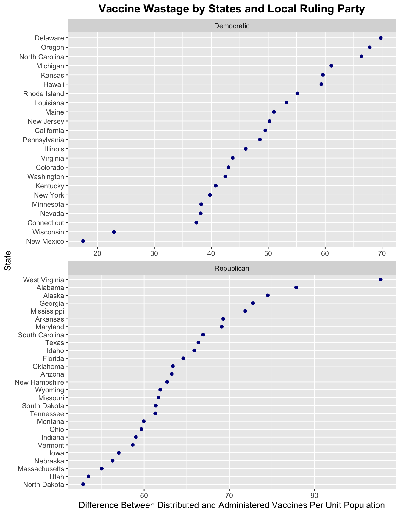
The main motive behind answering this question is to relate the vaccine wastage in a particular state. As the exact details about vaccine wastage has not been released by the government, we try to define a metric which can capture the vaccine wastage in a particular state across the United States. The vaccination dataset available for public usage lists two columns namely “Administered Vaccine doses” and “Distributed Vaccine Doses”. These two columns represent the amount of vaccine distributed to a state on a particular date and the amount of vaccine used by the state on a particular date.
We take the difference between these two values to arrive at an approximate metric which denotes as to how much vaccine was actually given to the public on the given day. To normalize the results along different states, we divide this difference with the population of a particular state. Hence, the final metric is defined as follows:
\[ Metric = \frac{( Administered - Distributed )}{State Population} \]
The above graph then shows which state has the highest value of the metric faceted along with the political party ruling that state during the vaccination period. As we can see the value of the metric is significantly higher for states with republican ruling party (in the range of 30 - 110). On the other hand, the value of the metric is spread out and significantly lower for states with democratic ruling party (in the range of 15 - 70). States ruled by Democratic party governor can be considered to be one of the factors contributing to the lower incidence of vaccine wastage on a particular day.
Also, states with higher vaccination density (vaccination per unit population) such as Vermont, Connecticut and Massachusetts have a lower value of metric indicating that the states with higher vaccination density also have vaccine wastage on a lower side.